
Manchester United, founded in 1878 as Newton Heath LYR Football Club, is one of the most admired football clubs in the world. The Red Devils, as they’re famously known, became Manchester United in 1902 and moved their stadium to what is now known as the Theater of Dreams, Old Trafford. The history of the club, spanning over almost a century and a half, is rich with yarns of glory, tragedy and fairytale fabric.
The Manchester United crest, one of the most distinguished in the world, has also seen its fair share of amendments. The crest, as we see today, features a red devil and a ship with the words ‘Manchester’ and ‘United’ written on two banners; one on top and the other at the bottom.
The crest has undergone a process of evolution to ultimately become the one that we see today.
The First Manchester United Crest
![]()
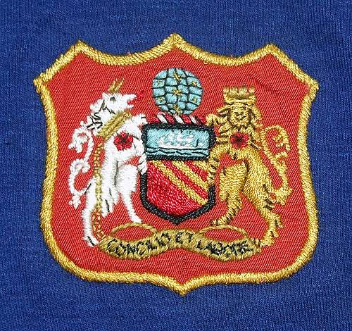
The original crest of Manchester United is one that barely resembles the crest that we see today. In fact, there are hardly any elements from the original one that the club has retained on their crest.
The original crest was gleaned from the logo of the Manchester City Coat of Arms. All that remains of the original crest is the ship in full sail. The ship exemplifies Manchester’s trading expertise and is also a representation of the ship canal.
Manchester is where the industrial revolution is said to have kickstarted. The globe is symbolic of their global trading prowess and the bees are a patent token of perseverance.
An antelope donning a golden chain signifies the city of Manchester’s achievements in the field of engineering. A lion with a castle crown which was also part of the crest is a throwback to the Roman hamlet of Castle-field around which the city is said to have grown.
The red rose sported by both the lion and the antelope is the official symbol of Lancashire, the county to which the city of Manchester belongs. Etched at the bottom part of the crest is the motto of the city of Manchester, ‘Concilio et Labore’, which translates to ‘wisdom and effort’.
The three stripes are representative of the three rivers, namely, the Medlock, the Irwell and the Irk.
The Second Crest – 1958
Following the Munich air disaster of 1958, Manchester United’s crest featured a golden eagle but this had a short life span. The eagle was popularly mistaken for a Phoenix symbolising United rising from the ashes following the disaster.
The third Manchester United crest – 1960s
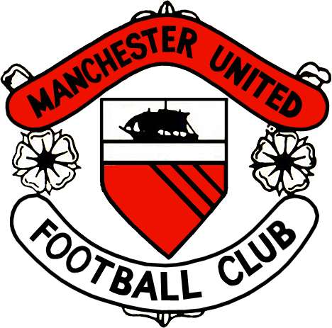
The crest remained unaltered until the 1960s before being altered. The new version had only extracted the shield, the stripes and the ship from Manchester City Council coat of arms. It also had a banner on top that wore the name ‘Manchester United’ while the one at the bottom read ‘Football Club’.
The new crest was an ode to the fresh style of football that United were playing under the guidance of Sir Matt Busby. The roses on the crest were interestingly coloured white (symbol of Yorkshire) for reasons still unclear.
The 4th Manchester United crest – the 1970s, 80s and most of the 90s
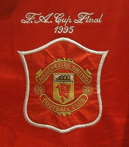
The christening of the United troops as the Red Devils in the late 60s by Matt Busby was a sharp indication of intent to break free from the image of blameless youth and modesty bestowed upon the young brigade through the famous nickname, ‘Busby Babes.’ This saw the new crest replace the three stripes with a devil.
The tag of Red Devils was inspired by a rugby team, namely, the Salford City Reds who were nicknamed Les Diables Rouges (which translates to The Red Devils) by the French press following their successful tour of the country in 1934.
As was common practice until 1970, United reserved wearing the club crest only for grand occasions like cup finals. But even then it was the Manchester City Coat Council of Arms logo that they got embroidered on the shirt. But the new crest featuring the devil took a permanent place on the shirt in the 1972-73 season.
In 1993, a slight change was made to the crest when the white lettering was changed to golden.
5th and current Manchester United crest
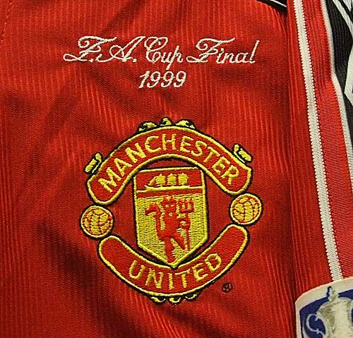
The new Manchester United crest, as we see today, came into being in 1998. The words ‘Football Club’ were ousted from the bottom of the logo and the word ‘United’ was demoted from its position on the top banner to the one at the bottom.
Manchester United was as big an enterprise as it had ever been and such a transition was carried out to typify United’s emergence and stature as more of a brand than just a mere football club.
Manchester United, over the years, especially under the guidance of Sir Alex Ferguson have been famously regarded for their ‘never say die’ spirit. This was exemplified in several of their performances in the 90s and the opening decade of the 21st century.
The Red Devils are well worthy of the ‘Red Devils’ tag for their intimidating presence in world football whilst also being the most successful English football club of all time.